With Mood Machine: The Rise of Spotify and the Cost of the Perfect Playlist, Liz Pelly unpacks Spotify’s primary goal, that being to hook users and reduce amount paid in association stream share. Instead of challenging capitalism on the back of the pirate culture, she explains how the platform is really an ultra-capitalist advertising company. Built on the back of learnings from torrent sites, the focus is on the illusion of frictionless. However, like the illusion of processed food, such magic ignores everything involved. Everything played by the user acts as a test, with the goal of the platform becoming the passive soundtrack to our lives, where the only competition is silence itself. This constant collection of data leads to the development of a ‘taste profile’, built around the idea of what you listen to and when. This simulacrum of ourselves risks taking a three-dimensional picture and flattening it into two dimensions. As a former machine learning engineer suggests:
“What do you want when you listen to music?” he continued. “I don’t think there’s a single answer. Some of the records that I would consider really life-changing, really profound, are records that in terms of listening time, they wouldn’t even show up in my top 100. Partially because they’re really challenging records. They’re records that opened me up to certain things. But they require a lot of investment. I’m not going to sit down and eat dinner to it. I need to be in a space where I can really devote myself. There is a lot of music that listeners find important but it’s not what you want to listen to all day.”
Ultimately, he determined that there was really only so much that could be gleaned from a bunch of information about someone’s listening history—from reducing a person’s music taste to a pool of data. “It’s like taking a three-dimensional picture and flattening it to two dimensions,” he told me. “It still has some relation to the actual object you’re trying to study, but it leaves out a fair amount. To say your tastes are really represented by a list of the things that you’ve listened to—almost anyone would say that’s not exclusively true. They’re correlated, certainly. But it’s decontextualized. Looking at a stream of all the tracks I’ve played, it tells you something.” But there is, of course, much that the data does not say.
Source: Mood Machine by Liz Pelly
For example, the focus on mood music and vibes that is a part of the two-dimensional vision is never really music that anyone knows and it does not create fans. While monetisation built around repeats moves artists away from more challenging ideas. It also leads to the development of cheaper standardised ‘perfect fit content’ where artists are legitimately paid to generate particular content – a concept similar to say a wedding artist – which Spotify then owns the masters for. One of the issues is that this all becomes centred around data about Spotify, rather than our music. Going beyond the town square, Pelly suggests that Spotify is best considered as another part of the social media shopping mall where you never quite know what is you and what is the algorithm.
In addition to corrupting the culture around music listening, Spotify pays labels and distros on percentage, rather than paying artists per play. This is further confounded by ‘Discovery Mode’ where artists can accept lower royalities in exchange for algorithmic promotion. This leads to the situation where independent artists are confronted with the question: “Is $0.0035 really better than nothing?” In case that was not bad enough, 86% of tracks with less than 1000 plays in the year are actually demonetised , while at the same time artists are being forced to do more and more.
“If retailers are going to take your vinyl album, it’s like, Well, what are you doing to tell people it’s on sale here? Are you doing street posters? It’s the same thing on digital services. It’s not just Ah yes, you’ve got a great record and we are going to support you. What’s the campaign? What’s the story? What can we expect? Have you got any festivals or TV appearances? All of these things feed into whether people support the music or not. I’d love to think it’s all about the music but it’s really not. Clearly having great music helps. But there’s actually a lot of great music out there.”
Source: Mood Machine by Liz Pelly
All in all, Spotify is akin to playing the slots where the house always wins.
For Pelly, the future involves rethinking profit motives and power structures. The fear is that with all the current constraints, we are losing music that will never be made.
if we keep giving too much power to corporations to shape our lives, and we don’t protect working musicians’ abilities to survive. We are foreclosing that possibility for music to evoke those ephemeral unknowns. We are losing a lot of music that will never be made. We are letting new expressions, emotional articulations, and points of connection slip away.
Source: Mood Machine by Liz Pelly
In the end, the challenge is bigger than music, it is about building the world that we want.
Mood Machine is a strange book. On the one hand, many of the ideas neither felt new or read is somehow obvious. For example, here are some links from my bookmarks collected over the years:
Reflecting upon Spotify’s Wrapped, the yearly review, Kelly Pau reminds us of the place of algorithms and artificial intelligence embedded within these choices and recommendations, which often come with their own sets of biases and assumptions around gender and mood.
Wondering about how much Spotify understands us, Meghan O’Gieblyn explains that there are limits to how much an application can know, such as your thoughts and beliefs, personal history, and the unspoken nuances of the relationships that have made you who you are.
Discussing the collapse of genre and music loyalities, Jack Hamilton argues that Spotify’s main focus is time on app and the data it can collect from this.
The Patent Drop newsletter explores a patent for mood-recommendations based on wearable data and what this actually means. For example, do you suggest songs that allow a user to revel in that mood, or do you suggest songs that try to shift a user’s mood.
Unpacking the Discover Weekly feature, Sophia Ciocca discusses the three main types of recommendation models that Spotify employs: Collaborative Filtering models, Natural Language Processing (NLP) models, and Audio models.
Widening the sources of data used to help profile users, Sarah Zhang discusses Spotify’s move to team up with AncestryDNA to provide richer results and the problems with this.
Discussing the role of technology in our future as a part of her Boyer Lectures, Genevieve Bell argues that all companies now are first and foremost data companies, whether it be a music application, a supermarket or an airline.
Yet, I had never really joined all the pieces as Pelly does in such a concise manner in Mood Machine.
I was interested in Pelly’s exploration of the problems with how Spotify captures our data to build a profile and how this does not really capture all the ways we listen and consume. It is interesting to consider the way in which Spotify helps mold a ‘templated self’ or what David Marshall describes as a ‘dual strategic persona’. As Michel Faber captures in his book Listen, music and the act of listening is so much more than can be condensed down into a few data points.
Personally, I am always intrigued by both the suggestions for different playlists or end of year. I always wondered how this information was garnered, especially when it compiled such weird mixes as this combination of Fleetwood Mac, Nine Inch Nails, Supertramp, Bruce Springsteen, Tool and Neil Young:
I knew that Spotify collected information around key and scale, but I was unaware of the other elements that fed the ‘taste profile’. (Ironically, I actually listened to the above playlist wondering if in fact it worked together. Sad to say, it did not. I wonder what Spotify took from that?)
Often I will read the name of an artist somewhere, not a mood or anything, and go and listen to a track or an album to find out more. This is not a ‘like’ or anything else, it is simply serendipitously perusing the shelves. The same can be said when I dive into some human playlists, from artists such as Fourtet, Caribou, Jamie XX, Aphex Twin, Worker & Parasite and Twinkle Digitz, or based on books and podcasts, such as Half Deaf, Completely Mad, Rip It Up and Start Again and Only the Shit You Love podcast. In addition to this, there are times when I play music for my children. Yet Spotify takes all this and somehow flattens it into the same sausage.
In the end, I feel that Mood Machine provides an account of the enshittification of Spotify. With this, I appreciate the push for different models, but fear that I am trapped in convenience, especially when I am within a family account where it is bigger than me. Here I am reminded of Cory Doctorow’s point about collective action:
Any time you encounter a shitty, outrageous racket that’s stable over long timescales, chances are you’re looking at a collective action problem. Certainly, that’s the underlying pathology that preserves the scholarly publishing scam, which is one of the most grotesque, wasteful, disgusting frauds in our modern world (and that’s saying something, because the field is crowded with many contenders).
Personally, I have turned to vinyl and Bandcamp for supporting artists and trying to step beyond my ‘taste profile’. However, I always find limits to this. However, maybe I need to accept that frictionless experience comes at a cost:
Resisting the algorithm is hard and often requires sifting through more noise yourself to find the signal, but it is doable with intention. It takes both knowing what you are looking for and being open to finding something totally not what you were expecting.
I get a lot of requests for writing various queries, focusing on different information. Although I am always happy to help out, I am also interested in potential of creating spreadsheet templates that people can copy and use themselves. One template I developed recently was build around interpreting different data exports.
Often these export files have a lot of information, which people get lost in. Although they could just delete the columns that they do not want, the feedback is that that process is tedious. Therefore, I created a spreadsheet where users can import a CSV and then select the fields that they want to work with. I did this using a QUERY formula and a series of checkboxes associated with which columns to SELECT and which columns to ORDER BY.
="{QUERY(Sheet1!A1:CJ,"&char(34)&"SELECT "&JOIN(", ",QUERY(A3:D,"SELECT C WHERE D = TRUE"))&" ORDER BY "&JOIN(", ",IFNA(QUERY(A3:E,"SELECT C WHERE E = TRUE"),"Col1"))&char(34)&",1)}"
Users can then copy the query formula and run it in a separate tab.
The current workflow can be summarised as follows:
Import the data spreadsheet (File > Import > Upload > Browse > Open > Insert New Sheet(s) > Import data). This will bring the data into a new tab ‘Sheet1’
In the SUMMARY tab, refresh the formula in cell A3, then use the checkboxes to select which fields to be displayed and the field(s) to order by.
Copy the formula created in Cell B2 and paste it in Cell A1 in the data tab, adding ‘=’ at the start to activate it
Although this works fine, I was left wondering if it was possible to instead display the data dynamically, rather than copying and pasting the formula. I imagine that I would need some sort of ‘TO_FORMULA’ type of function, where the text is translated into a formula.
Each year in my work, we ask the question as to how might we improve efficiencies associated with the end of year process. In the past I have created a database of school contacts, a process for generating timetables and a template for reviewing data. Two particular requests that were raised this year were the desire to reduce emails associated with updates and personalise correspondences sent to schools.
A Dashboard of One’s Own
In the past we used to have a dashboard with a dropdown as to who completed each task for each school. The problem with this was two fold. One, schools had no visibility to where the end of year process is at as this was only visible to support staff. Two, there was a lot of dependency on emails to know where things are at.
Associated with this, we shared a template with each school which included form allocations. My solution was to create a tab in the school template with a checklist that provided schools with clarity where the process was at and then pull this information into a shared spreadsheet so that the support team had an understanding where things were at. The challenge with this was to create and collect the templates in an efficient manner.
The process for generating the templates in the past was to manually create a copy using the /copy method and then sharing this with schools. This always felt cumbersome. I wondered if there was a more efficient method for creating the templates. I also wanted a more efficient method for collecting all the links. I remember Alice Keeler created a Google Sheets Add-on for making a copy of rubrics, so I knew that it was technically possible. Googling the problem, I found a video (and template) from Carl Arrowsmith that walked through using Google Apps Script to make multiple copies of same file.
What I like about finding such resources is getting into the code and unpacking how it all works, and then making my own changes, especially when the person sharing leaves various notes within the code to guide you. I have always wanted to dig further into Apps Script, but never really found the time to start from scratch. A couple of changes I made was including the school name and school number in both the template and title of the document. You can find a copy of my updates here.
Once I had made the changes, I generated a template for each school. This not only created all the copies, but also provided a copy of each URL in the spreadsheet. I then brought this list back into a dashboard and imported the checklist using the following formula:
In addition to adding conditional formatting to highlight whether the task was complete or waiting, I added a status cell to provide an update at a glance:
=IF($S2=FALSE,"Waiting on Support",IF($T2=FALSE,"Waiting on School",IF($U2=FALSE,"Waiting on Support",IF($V2=FALSE,"Waiting on Support",IF($W2=FALSE,"Waiting on School",IF($X2=FALSE,"Waiting on Support",IF($Y2=FALSE,"Waiting on Support",IF($Z2=FALSE,"Waiting on Support",IF($AA2=FALSE,"Waiting on School",IF($AB2=FALSE,"Waiting on Support",IF($AC2=FALSE,"Waiting on Support",IF($AD2=FALSE,"Waiting on Support","All Complete"))))))))))))
Although this summary did not provide details about who completed each task, it did however provide more visibility. I guess you can’t have everything?
Personalising Emails
The other improvement related to sending out an email to 300+ schools. In the past we would just use an Outlook template. However, as each of the emails contained a unique link, this no longer worked. As I had a list of these links in a spreadsheet, I worked out that I could just create a unique email for each school, with the link being a variable:
="Dear to whom it may concern,</code></p>
Below you will find a link to the Google Sheet.</p>
"&Sheet1!R4&"
Instructions for filling in this information can be found in the End of Year guide.</p>
School Support"
It then occurred to me that as I had a list of the staff associated with each school that maybe I could replace the cold ‘Dear to whom it may concern’ with ‘Dear NAME’. The problem I was faced with though is that I had all the names in one cell, with each on a new line:
Mahatma Gandhi
Virginia Woolf
Fiona Hardy
My first step then was to SUBSTITUTE the new line (CHAR(10)) with a comma:
=SUBSTITUTE(C4,CHAR(10),", ")
However, I was then left with the following:
Mahatma Gandhi, Virginia Woolf, Fiona Hardy
My next task was to somehow replace the last comma in the string with an ‘and’. Unsure how to go about it, I went online and found a REGEXREPLACE on the Infoinspired website that achieved the desired outcome:
=regexreplace(A1, "(.*),", "$1 and")
This then provided me with the following:
Mahatma Gandhi, Virginia Woolf and Fiona Hardy
I then wondered if I could somehow remove the surname and leave only the first name in the list. After scratching my head for a while, I wondered if I could QUERY the list and select only the names that were not followed by a comma. I found the following REGEX formula:
"^[^,]+$"
I subsequently, SPLIT and TRANSPOSED my list of names and used a QUERY with a match containing the REGEX formula.
Returning to my email template, I then replaced the ‘to whom it may concern’ with the formula. This meant I could quickly and easily create an email that addressed the actual users and included their spreadsheet.
="Dear "®exreplace(SUBSTITUTE(JOIN(", ",QUERY(TRANSPOSE(SPLIT(SUBSTITUTE(C2,CHAR(10),", ")&","," ")),"SELECT * WHERE Col1 MATCHES '^[^,]+$'")),CHAR(10),", "), "(.*),", "$1 and")&",
Below you will find a link to the Google Sheet.
"&Sheet1!R2&"
Instructions for filling in this information can be found in the End of Year guide.
School Support
Providing the following outcome:
Dear Mahatma, Virginia and Thomas,
Below you will find a link to the Google Sheet.
UNIQUE LINK
Instructions for filling in this information can be found in the End of Year guide.
School Support
—
I am sure there are more efficient ways to achieve the same outcome using different applications that I do not necessarily have at my disposal. For example, it would be even better to automatically send the the email from the Google Sheet, rather than copy and pasting the text into Outlook. I also must be honest, even though I completed Ben Collins’ REGEX course, I still have not got my head around it all yet, but I feel that the first point of learning is not always knowing how to do something, but actually knowing that it is possible.
One of the things that I often struggle with is with the purpose my online meanderings. Although I agree about ‘collecting the dots‘, it can sometimes be hard to justify in amongst the everyday hustle and bustle. However, again and again I find myself diving into something I read long after the fact.
Today I was testing barcodes with an electronic sign-in system. I had a Crystal Report which produces student cards that included a barcode associated with the ID. However, I found that although I could get them to work with the scanner, it was very fiddly and was far from optimal.
Knowing that any adjustments to the Crystal Report would take some time as it involved a number of teams and processes, I wondered if I could produce my own cards using a spreadsheet. I noticed that the third-party application used a QR Code when enrolling a new device which has really quick, so I wondered if I could also use a QR Code for the student cards. After doing an initial test with one student ID to confirm that QR Codes would work, I searched up a post from Ben Collins regarding the generation of QR Codes using Google Sheets. After exporting a test copy of the student data and importing this into the Google Sheet in Sheet1, I created a template where a QR Code was generated for the each student ID:
=ARRAYFORMULA(IMAGE("https://chart.googleapis.com/chart?chs=250x250&cht=qr&chl="&ENCODEURL(QUERY(Sheet1!A2:A,"SELECT A WHERE A IS NOT NULL")) ))
Then in the next column I entered the student details, including first name (Column L), last name (Column K), class/form (Column I), year (Column F) and ID (Column A). I also used Char(10) to separate this information onto different lines.
=ARRAYFORMULA(QUERY(Sheet1!L2:L,"SELECT L WHERE L IS NOT NULL")&" "&QUERY(Sheet1!K2:K,"SELECT K WHERE K IS NOT NULL")&""&Char(10)&"Class "&QUERY(Sheet1!I2:I,"SELECT I WHERE I IS NOT NULL")&" / Year "&QUERY(Sheet1!F2:F,"SELECT F WHERE F IS NOT NULL")&""&Char(10)&"ID "&QUERY(Sheet1!A2:A,"SELECT A WHERE A IS NOT NULL"))
I was then left with a list of cards, the problem is that I wanted to print two columns to a page. To achieve this I created two dynamic named ranges, one for column one:
Then in a new tab I used the INDIRECT formula to bring in the two columns.
The last step was to adjust the printer settings. This included extending the margins and changing the scale to 55%.
Knowing that this would be used by different people, I made a copy of the template and deleted Sheet1 that could be used as a master. I then put together the following instructions for how it could be used from scratch.
1. Create a copy of the QR Code Google Sheet https://docs.google.com/spreadsheets/d/1lzfHDR9229g5xWTb16JPRjKDTBHlix1NmOTJE9fp-ck/copy
Import the student spreadsheet previously saved and Insert a New Sheet
Click on Sheet2
Click on Cell A1 and press Enter
Click on Cell B1 and press Enter
In Cell E2 add ‘=’ at the start of the formula
In Cell F2 add ‘=’ at the start of the formula
Click on StudentCards tab
Click on FIle > Print
Not sure if anyone else has used Google Sheets for similar purposes. Comments appreciated.
Explain what you think are some of the key differences between cyber security, cyber awareness and cyber safety. To what extent are you teaching these in the classroom or to what extend do you think they should be taught and why?
For me, Cyber Security is about the solutions and services that keep us protected. This might involve people and programs. It can be understood as being a part of what Ursula Franklin described as technology as a system:
Technology is not the sum of the artefacts, of the wheels and gears, of the rails and electronic transmitters. Technology is a system. It entails far more than its individual material components. Technology involves organization, procedures, symbols, new words, equations, and, most of all, a mindset.
Cyber Awareness on the other hand is having some knowledge and understanding of this system and how it fits together, while Cyber Safety is the action of this knowledge and understanding.
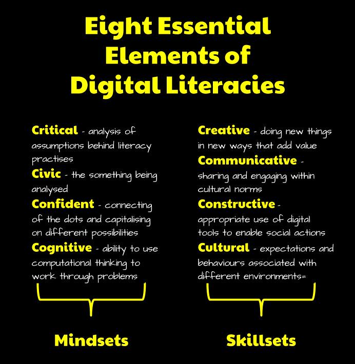
One way of appreciating this divide is to divide the topic between mindset and skillset. This is something that Doug Belshaw touches upon in his exploration of digital literacies.
For example, consider an application like Hapara. From the perspective of mindset and understanding:
Cognitively and confidence involves appreciating new ways of working. Although it may be more efficient, if you have been using GSuite, these are still habits to unlearn and relearn.
From a critical and civic point of view, it is important to consider why there is a need to manage learning at all and the consequences associated with such actions.
Whereas from the perspective of skillset and actions:
From a cultural perspective, Hapara posits that teachers are largely responsible for creating the conditions for learning.
Constructively, there is a blur between empowering students with the power to participate in actions and the dangers in excessively moderating their learning.
From a communicative point of view, GSuite allows a number of ways to engage, Hapara provides the means to manage and moderate this within different cultural norms.
Connecting with GSuite through the use of APIs, Hapara has the ability to both hinder and help the creative process depending on how it is deployed.
Share with the community a way you would like to introduce networks into the classroom to make it tangible or visible for primary students. It could be using a resource you have found or your own idea or thoughts.
Two activities that I have used in regards to helping student appreciate networks are paper blogs and mapping the internet.
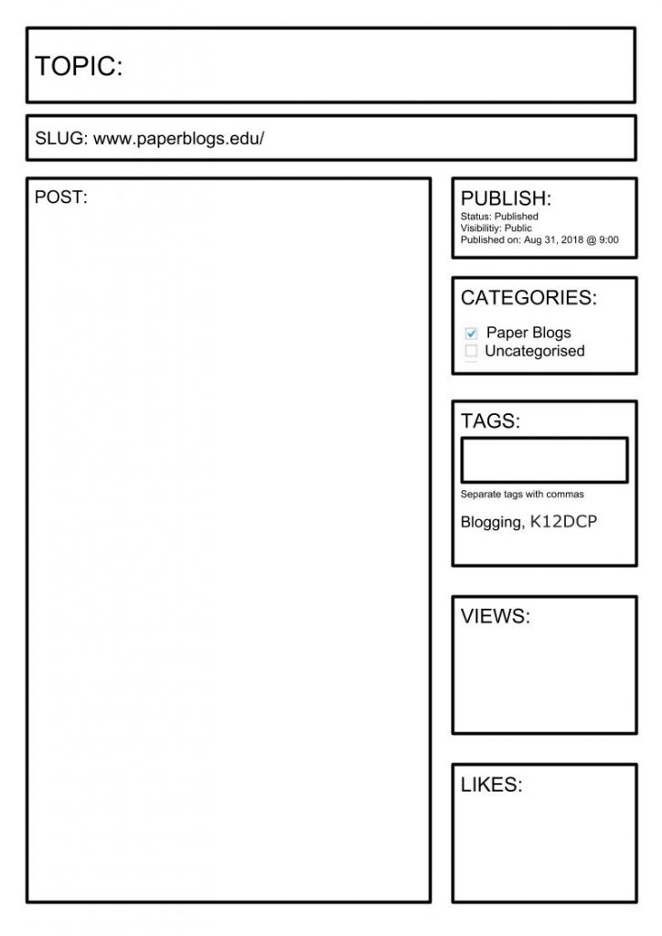
PAPER BLOGS
Students use the a template to create a paper blog post. They then post it on the World Wide Whiteboard.
Paper Blog Template inspired by Bianca Hewes
Students then walk around the room and read the posts leaving various data traces, such as:
When in Visitor mode, individuals decide on the task they wish to undertake. For example, discovering a particular piece of information online, completing the task and then going offline or moving on to another task.
Where as:
When in Resident mode the individual is going online to connect to, or to be with, other people. This mode is about social presence.
Students are given a copy of the the map of the internet and are asked to plot the various spaces they exist in online and where they sit along the continuum.
This is activity is useful for thinking about the networks they are a part of and the way in which their data is spread across the web.
Thinking about this activity now, it is interesting to consider this in regards to cyber awareness and what data we share even when we are just ‘visiting’.
Share an activity idea or classroom resource that you have found online or created yourself that involves primary students exploring private and public information sharing. It could be a video, lesson plan, storybook, song or anything else!
One resource that I have found really useful in exploring the divide between public and private sharing has been blogs using Global2/Edublogs. Students created blogs focusing on a passion. The sites were viewable by other students in the class, but not anybody outside of that. These were all connected by a classroom blog, which was made public. This served as a resource as well as a example. For me, the interconnected nature of these sites allowed students to interact through the Dashboard Reader, helping create something akin to a social media space. Blogs served as a tool to learn with in that students were able to share their ideas and learnings, as well as learn about sharing information, both private and public, and how we interact with this information.
Unit 3 – Information Safety and Security
We have shared a few examples of how information can be extracted from data (such as in your images). What are other ways humans can leave traces of information with the use of technologies? Share an example or examples with the community.
Some other examples of where information can be extracted from data include:
What other interesting examples of codes from history or the modern-day (digital or non-digital) can you find to inspire or support a lesson about encoding and decoding messages?
For those wanting to go to the next level in regards to encryption could look at the Enigma Machine from World War II.
This coding machine used by the Germans in World War II involved a two step process. Firstly, the machine itself had a keyboard which once pressed ran a signal through a number of variables, including rotors and plugs, which helped to scramble the code. This all depended on a second documented which stipulated how the rotors and plugs were to be set. So in order to break the code you would need both the machine and the current configuration. In some ways this has similarities with private and public encryption, where somebody maybe able to get access to the ‘public’ machine, but unable to make any sense of this without cracking the ‘private’ configuration.
Paul Scruton has visualised how the Enigma Machine worked in this Guardian infographic:
While Tom MacWright has created a virtual model of the machine which allows the user to not only configure the machine and enter a message to be encrypted, but also follow the signal as it passes through the various stages.
Find and share a resource to support teaching students in primary years about information sharing or safe communication. Include a brief description.
COMMENTING ON BLOGS
When introducing blogging in the classroom, I used to follow up my focus on paper blogs with a focus on commenting and communication. This began with a ‘turn and talk’ about why we communicate online? I would then watch Linda Yollis’ video on quality comments.
After watching this, students worked together to complete a Found Out, Made Me Think.
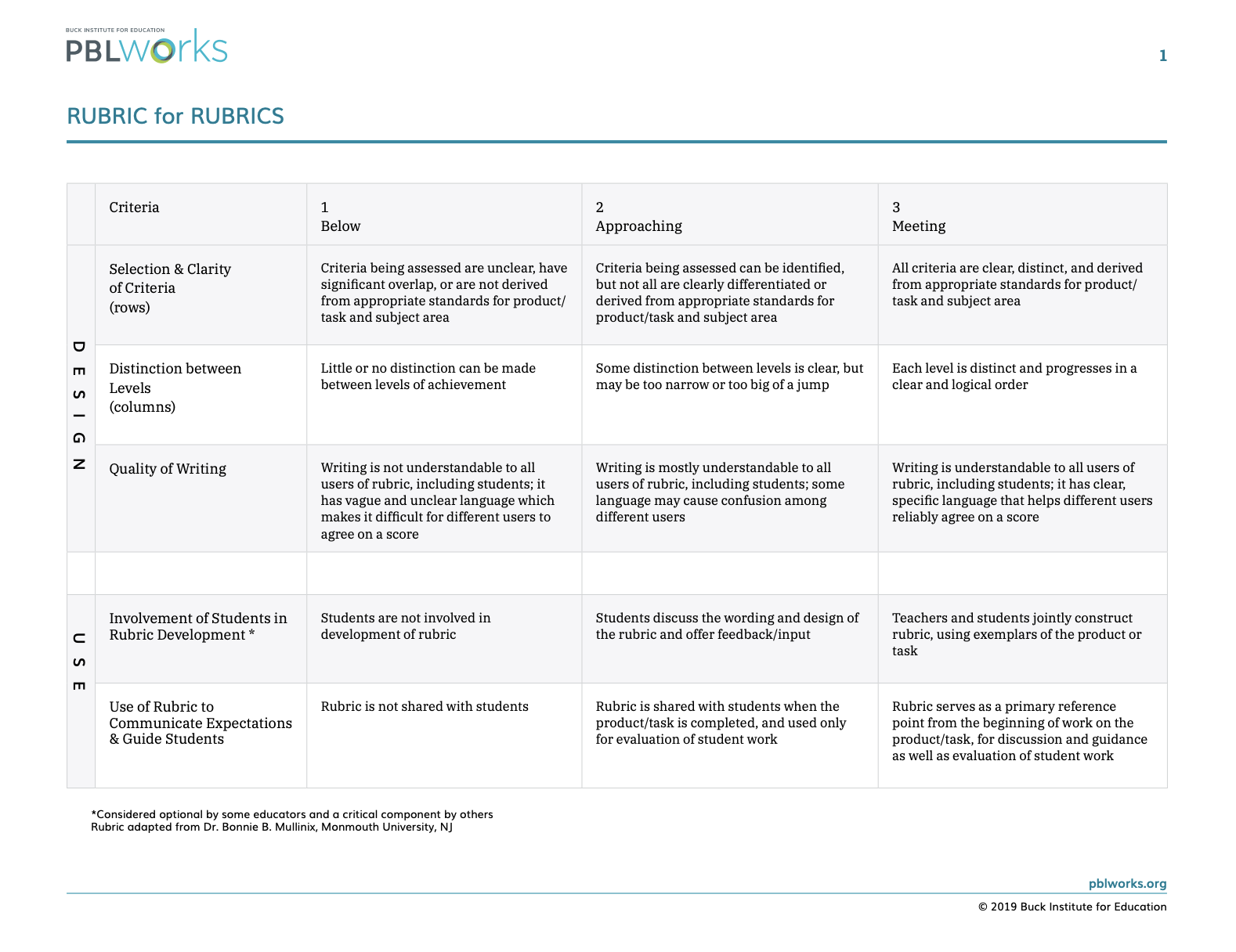
Once the class had thought about comments, we created a set of guidelines which were then used in the creation of a rubric that students could be used as a reference. To support this students refereed to the Rubric for Rubrics to help them.
What mattered most for me was creating a space where students could learning through the experience of commenting, especially as some of my older boys were already engaging in 4Chan, meme and trolling culture. Therefore, this rubric was something that we returned to regularly as particular situations arose.
Thinking about this now in regards to the challenges of moderation on social media (see posts about YouTube and Facebook), I wonder about extending this by discussing what changes they would make if they were moderating comments for every class in the school (or even whole world) and what a digital solution for this might look like?
Unit 4 – Internet Security
What are some primary-friendly “scam scenarios” that you could use in the classroom for encouraging students to critically think about messages they receive? Create your own “fake scam” to share with the community so they can try and spot the tell-tale signs!
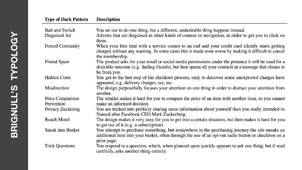
Rather than Nigerian prince or stranger danger, I think that the best scam that children need to learn to be aware of are the surreptitious scams they learn to live with every day. These are what Harry Brignull coined as ‘dark patterns‘.
Dark Patterns are intentional user interfaces to trick you into doing something. As Brignull explains:
Normally we think of bad design as consisting of laziness, mistakes, or school-boy errors. We refer to these sorts of design patterns as Antipatterns. However, there’s another kind of bad design pattern, one that’s been crafted with great attention to detail, and a solid understanding of human psychology, to trick users into do things they wouldn’t otherwise have done. This is the dark side of design, and since these kind of design patterns don’t have a name, I’m proposing we start calling them Dark Patterns.
In an interview with Brignull, Per Axbom and James Royal-Lawson provide their own definition of dark patterns as,
A gap between perception of what you are doing and the reality of what you have done. – 30 mins
Dark patterns are the canaries in the coal mine of unethical design. A company who’s willing to keep a customer hostage is willing to do worse.
Arvind Narayanan, Arunesh Mathur, Marshini Chetty, and Mihir Kshirsagar suggest that such patterns have developed over over over time:
Although they have recently burst into mainstream awareness, dark patterns are the result of three decades- long trends: one from the world of retail (deceptive practices), one from research and public policy (nudging), and the third from the design community (growth hacking).
Harry Brignull has created a site dedicated to all things dark patterns, including a list of examples:
Alternatively, the research team at UXP2 have broken Brignull’s list down into five particular strategies:
Nagging
Obstruction
Sneaking
Interface Interference
Forced Action
In the end, Daniel Fitton suggests that what is most important is a critical understanding.
Dark design is used to influence our decisions about our time, our money, our personal data and our consent. But a critical understanding of how dark patterns work, and what they’re hoping to achieve, can help us detect and overcome their trickery.
The question is what this all means for young children. When you scroll through the abundance of examples shared in the subreddit community and in Brignull’s hall of shame, they seem beyond the world of a twelve year old, let alone a five year old. However, it could be argued that so many habits actually stem from what actually happens during the early years and how technology is approached. Thinking about this from the perspective of digital literacies, so much time is spent on skillsets, such as being creative and communicative, but mindsets, such as critical and cognitive thinking, are just as important.
Therefore, thinking about patterns in general, the focus at at F to 2 could be to explore the shapes and colours used in applications. Investigate the ways we represent information about applications using software and digital systems. Use software to create a positive and a negative representation of data. Investigate in-app purchases and the ways users are enticed to sign-up or purchase add-ons for additional features, like stickers and bonuses.
In 3 to 4, students might explore the different types of data engaged with in online spaces. This could include something like paper blogs and leaving physical dots to represent engagement. As well as continue to explore the representation of different types of data and information, including the application of ethical and social protocols.
In 5 to 6, students could form a definition of dark patterns and how they impact users. This could include the developing solutions which demonstrate such patterns. Associated with this, they might develop protocols for how to respond to such patterns.
There is so much written about passwords, what makes a strong ones, how to go about maintaining them. For example, the Twinkl team recommends six rules:
include numbers, letters and symbols
use at least one capital letter
make it something you will remember but others won’t think of
Associated with these tips, she puts forward some particular strategies:
Revised passphrase method where you compose a phrase using bizarre and uncommon words a phrase that gives you a mental image.
The sentence method combines a random sentence with a rule that makes it gobbledegook.
Muscle memory method where a random group of characters is memorised as a pattern.
Micah Lee elaborates on the discussion of passphrases, discussing the Diceware method:
First, grab a copy of the Diceware word list, which contains 7,776 English words — 37 pages for those of you printing at home. You’ll notice that next to each word is a five-digit number, with each digit between 1 and 6. Here’s a small excerpt from the word list:
24456 eo
24461 ep
24462 epa
24463 epic
24464 epoch
Now grab some six-sided dice (yes, actual real physical dice) and roll them several times, writing down the numbers that you get. You’ll need a total of five dice rolls to come up with the first word in your passphrase. What you’re doing here is generating entropy, extracting true randomness from nature and turning it into numbers.
If you roll the number two, then four, then four again, then six, then three, and then look up in the Diceware word list 24463, you’ll see the word “epic.” That will be the first word in your passphrase. Now repeat. You want to come up with a seven-word passphrase if you’re worried about the NSA or Chinese spies someday trying to guess it (more on the logic behind this number below).
Using Diceware, you end up with passphrases that look like “cap liz donna demon self,” “bang vivo thread duct knob train,” and “brig alert rope welsh foss rang orb.” If you want a stronger passphrase you can use more words; if a weaker passphrase is OK for your purpose you can use less words.
The something you know is the password, and yes it’s still a good idea to have a strong password, something with enough length and complexity that is hard to guess but easy to remember. But it’s not enough. It’s just one factor.
The second factor is something you have, or something you physically carry with you, such as a phone or touch key. Unless the hacker or foreign power actually has your phone, they can’t access your data, even if they know your password. Just like the two keys for the front door, they need both your password AND your phone at the same time. If they have both those things, you may just have bigger problems to deal with.
All this advice is helpful, but not necessarily practical for young learners. Although a passphrase made using the Diceware method used in association with two-factor authentication may be considered an ideal outcome, the question remains how young learners are supported with building up their confidence and constructive capacity to manage such workflows?
In regards to learning activities, there are various resources available, however too often they come across as one-off lessons, a passing of the knowledge akin to the Matrix, rather than a gradual release over time.
The risk with this approach is that if a student was not there for this one-off experience, then they can miss the transer of knowledge.
One person to approach the problem differently is Audrey Nay, she has put together a continuum of learning starting at Prep and going to Year 6. The journey starts with a basic passwords letters and ending with a 6 character mnenomic with a mixture of numbers, upper and lower cases, and punctuation. Although I like how she has broken down the sequence of steps across the years, I wonder about the outcome of a 6 character mnenomic, as opposed to a passphrase. As Micah Lee explains:
Not too bad for a passphrase like “bolt vat frisky fob land hazy rigid,” which is entirely possible for most people to memorize. Compare that to “d07;oj7MgLz’%v,” a random password that contains slightly less entropy than the seven-word Diceware passphrase but is significantly more difficult to memorize.
Supporting the process of reflection, passwords resource developed in conjunction with Code.org and Common Sense Media flips the various requirements into a series of statements. An approach could be used where each stage is defined by a different set of questions built up across time.
One of the other challenges to passwords being a ‘once-off’ activity is that such activities are often done to students, rather than with students. This often stems from the ramifications of poor passwords. For example, sometimes platforms have built-in feedback mechanisms that force users to enter a number, character and symbol. Also, based on logistics passwords are often managed for students using generators like Dinopass or Google Sheet tempaltes. Digital Technologies Hub’s answer to this is to go beyond a mere list of rules, suggesting that students create an artefact (i.e. a poster) explaining their understanding. Alternatively, sites like How Secure is My Password can be useful to support students for testing processes.
This all has me thinking about alternatives for logging in, such as the use of biometric information, patterns and images. I wonder what ‘passwords’ might look like for students in ten years time?
Share your thoughts on what you imagine to be the future of cyber attacks. Consider the types of information we store and share online today. What information will hackers try to get in the future? What approaches do you think they will use?
I think the future of hacking and cyber attacks is the linking of different datasets that we openly share online through data brokers to provide an insight and awareness of individuals that will open up new possibilities.
These companies often acquire the information through purchase, licensing, or other sharing agreements with third parties. Oracle, for example, “owns and works with” over 80 data brokers, according to a 2019 Financial Timesreport, aggregating information on everything from consumer shopping to internet behavior. However, many companies also scrape data that is publicly viewable on the internet and then aggregate it for sale or sharing. “People search” websites often fall into this latter category—compiling public records (property filings, court documents, voting registrations, etc.) on individuals and then letting anyone on the internet search for their information.
This impact is only amplified by the influx of connected devices and online accounts.
Unit 5 – Cyber Ethics
Find a resource (a website, video or storybook) for teaching a topic related to cyber ethics and share this with the community. Provide a brief explanation.
A useful post I have found in regards to cyber citizenship (and ethics) is Kathleen Morris’s Teaching Digital Citizenship: 10 Internet Safety Tips For Students (With Posters). Morris outlines her four layered approach to teaching digital citizenship. This focuses on integrating the various skills within the curriculum, providing real world stories to reflect upon, building up student toolkits and developing lines of communication. Associated with this, she also provides ten tips for students.Poste
I have been spending quite a bit of time lately thinking about how to improve my processes. Here is another example.
I was recently asked to review the setup of a number of schools that I am a part of supporting. At the moment there are nearly three hundred schools. Once upon a time when there were only fifty or so schools. Back then, such a task was tedious, but not that time consuming. However, as the numbers increase, such reviews start to become a cumbersome affair.
The focus of my analysis was understanding the rollover rules for each semester. This started with the creation of a unique list of all the schools in the data set using the UNIQUE formula. With this list, I also created an additional number column in which I numbered each school. I then used a VLOOKUP to add this information to the data so that I could visually break-up the data using conditional formatting with the custom formula.
= ISEVEN($B2)
For the next step, I created a data validation to help categorise what sort of setup a school had. In addition to this, I created a data validation for the issues column produced from the column itself. To do this I created a separate UNIQUE column, summarising all the issues. I then referenced the UNIQUE column and simply chose ‘show warning’ for an invalid responses. This way, if there was an issue I had previously entered, I simply selected them from the dropdown list.
Once complete, I created a series of queries MATCHED with the various issues and then used a JOIN to summarise all the schools associated with each issue in one cell:
=ARRAYFORMULA(JOIN(", ",TRANSPOSE(QUERY(A3:J202,"SELECT A WHERE J matches '.*Description of the issue.*'"))))
On reflection, I wondered how I could cut down on this manual process. My intent was to create a template in which I could load the raw data and then have it broken down for me using formulas.
After spending a lot of time trying to reverse engineer the output I wanted using various IF, FILTER and UNIQUE formulas, I realised that rather than trying to embed everything in one formula, I maybe better suited in creating an additional table to help further organise the data.
The first step was to pull the data into this helper table using a QUERY. This means that once loading external data into sheet1 (the default first sheet), I just needed to refresh the query for everything to work.
In addition to this, I created a unique reference for each line by joining together the different pieces of information associated with each line to make a unique reference.
=TEXT(JOIN("",C2:F2),"")
In a new tab, I put together an analysis of the schools. I started this by generating a UNIQUE list of all the schools.
=UNIQUE(DATA!A2:A)
Using this data as a reference, I then created a query for each school, joining the different rollover rules together.
=(JOIN("|",QUERY(DATA!A$2:I,"SELECT I WHERE A = '"&A2&"'")))
I then used this data to produce a summary of the data. This began with a UNIQUE list of combined rollover rules.
=UNIQUE(QUERY(SCHOOLS!A2:C,"SELECT B,C WHERE A IS NOT NULL"))
Using this as a reference, I queried all the schools with the same rule and joined this data together.
="E"&JOIN(",E",QUERY(SCHOOLS!A2:B,"SELECT A WHERE B ='"&C2&"'"))
I also created another columns in which I used a SWITCH formula to describe each of the sets of rules in a more meaningful manner beginning with a category: “standard”, “two semesters” and “needs to be fixed”. Associated with this, I created a column which pulled this category and then used this information to create a series of conditional formulas in order to visually differentiate the different setups.
For anyone interested, a copy of the template can be found here.
After completing this exercise, I have found that I can easily adjust this template for any other data I wish to analysis quickly. It is also testament to the power of making your own tools. I am left wondering if I could use macros or scripts to improve the process, but for now my formulas all duct taped together is working for me. As Tom Woodward sums up:
I’m not a programmer so I have to find ways to get things done until I learn more.
I was recently asked to have a look at spreadsheet that listed all the guides and videos located in a support folder as a reference. This folder also included a number of folders within folders, which created a level of complexity.
The current workflow involved using an Add-on File Cabinet from the developers behind Awesome Table to generate a list. The problem with this list is that the exported data was not in the desired format. Whereas the output focused on file, folder and link, the list produced using File Cabinet included other information such as owner, creation date and file size. In addition to that, there were some folders and files listed that needed to be removed. Therefore, it had become manual heavy exercise to refresh the data and update the directory meaning it did not happen that regularly.
After looking at the list and the current finished product and the list produced using File Cabinet, I realised that rather than displaying the sub-folder, that the directory was showing a top level folder. Therefore to manage this, I used a SWITCH formula to create a new column updating the folder name to the overall area it belonged to.
To create the SWITCH, I created a UNIQUE list of all the folders and then pasted them as values so that I could delete those not required to be displayed in the directory. After culling the list, I then added the area in the cell next to each folder. Once I had these two columns complete, I used this formula to add quotation marks to them all:
=ArrayFormula(""""&Sheet1!A:D&"""")
I then copied this list into the SWITCH formula and added in the commas:
=IFNA(SWITCH(B1:B,
" EOY 2020","EOY",
"Absences and Attendances","eSIS",
"Class Maintenance","eSIS",
"Crystal Reports","eSIS",
"Debtors","eSIS",
"eSIS - Information Sheets","eSIS",
"eSIS Navigation-Overviews","eSIS",
"General _ Misc","eSIS",
"Managing Community","eSIS",
"Managing Student Lifecycle","eSIS",
"Reporting","eSIS",
"Staff Maintenance","eSIS",
"Student Medical Maintenance","eSIS",
"SynWeb","eSIS",
"Timetabling","eSIS",
"eLearn General ","eLearn",
"eLearn QRGs","eLearn",
"Accounts Payable","eFIN",
"General","eFIN",
"Purchasing","eFIN",
"ePortal","ePortal",
"Create New Staff","eHR",
"eHR - General","eHR",
"eHR Materials","eHR",
"Employee Self Service","eHR",
"Employee Self Service (ESS)","eHR",
"End of Year 2020 - eHR & Payroll Guide","eHR",
"Leave","eHR",
"ICON General Information","General Information",
""," "
))
With this addition column, I then used a QUERY to capture the title, area and link to present as a directory in a separate spreadsheet to share with a wider audience:
=SORT(QUERY(IMPORTRANGE("docs.google.com/spreadsheets/d/.../edit","Sheet2!A:D"),"SELECT Col1,Col4,Col3 WHERE Col4 is NOT NULL"),2,FALSE)
Ideally, if creating this solution from scratch, I would probably have started each folder with a prefix indicating which area it belonged to, therefore avoiding the need for the SWITCH formula. However, that horse had long bolted. I also like the idea of using the SWITCH formula to manage which folders are displayed. It is definitely easier to pass on to somebody else.
I feel that it would be plausible to find a different script (see for example these examples from Alice Keeler, mesgarpour and Spreedsheet Dev) that might do some other things, such as run the process as a cron job or pull only the desired data. However, that is beyond my current skillset and patience level to dig any further at this point.. Therefore, I will stick to using various formulas to filter out the data for me.
In my work, I recently had an issue with absence data where the system had generated some duplicate data. Short of creating an actual report within the system (which I neither have the time or access to do), I decided to have a go at creating a reusable template that I could easily share with anyone. The idea was to take the data and produce a number of specific outputs, including the duplicates and a specific set of ‘All Day’ duplicates.
I started the template by creating a spreadsheet with three tabs: Sheet2, DUPLICATES and ALLDAYDUPLICATES. Sheet2 contained a summary of the ID, event data, name, absence type and event type.
=QUERY(Sheet1!A1:R,"SELECT A,R,E,F,G WHERE A IS NOT NULL")
I then made a column of unique data by combining the ID and event date. To do this, I used Ben Collins’ trick using formulas in a named range as a means of capturing the variability of the data.
I borrowed this formula in part from Collins who used something similar to use Conditional Formatting to highlight duplicates:
=countif(A:A,A1)>1
In the DUPLICATES tab, I created a QUERY that brought in the duplicates ordered by date
=QUERY(Sheet2!A:G, "SELECT A,B,C,D,E WHERE G = TRUE and A IS NOT NULL ORDER BY B")
While in the ALLDAYDUPLICATES I created another QUERY which focused on ‘All Day Absences’
=QUERY(DUPLICATES!A:E, "SELECT A,B,C,D,E WHERE E = 'AllDayAbsence'")
With all this in place, to query any data, I make a copy of the template. I then import the absence data exported from the external system. Although I could possibly copy and paste the data, I have found that this is fraught with dangers. In regards to the ‘Import Location’ I select Insert New Sheet(s). This then loads the new data into Sheet1. I then click on the formula in Sheet2!A1 and press enter to refresh the QUERY formula and populate the rest of the spreadsheet.
For those interested, a copy of the spreadsheet can be found here.
—
Growing up, I never really went deep into the world Microsoft Excel. It was not until exploring Google Sheets that I started appreciating the power and potentials. One of the consequences of this is that a lot of the habits that I have learnt are not applicable in reverse. For example, Ben Collins has a site discussing the power of moving from Excel to Google Sheets. This includes a discussion of IMPORT features and the QUERY function. However, there is nothing that I am aware of that goes the other way. I guess this is the nature of coding in general. Every language has its own set of affordances and we work within these constraints. What the situation has taught me though is that sometimes solving problems is about working with what is at hand. I guess the challenge is developing our box of tricks so that we do have something at hand. In some ways, this reminds me of something Amy Burvall once said:
“in order to connect dots, one must first have the dots”
So what about you? What small tools have you created to solve a particular problem? What are the strategies that you use to continually add to your toolbox so that you are always ready when a problem may arise? As always, comments and webmentions welcome.
The current pandemic has led to many changes in habits. One of which is that I like to be prepared when I go to the supermarket, especially when doing a big shop. Fine I may not last out the two to three weeks that Zeynep Tufekci flagged early on:
For food, you can just buy two or three weeks’ worth of shelf-stable food that you would eat anyway, and be done; this could include canned food like beans and vegetables, pasta, rice, cereals or oats, oils/fats, nuts and dried fruits. It’s really not that hard because we’re talking two-three weeks, so whatever you get is fine. It doesn’t have to be expensive or super healthy or specialized ready-to-eat meals in camo boxes guaranteed to survive the meteor strike! Rice, beans, salsa, ramen, some sort of cooking oil, oatmeal, nuts and dried or canned fruits and vegetables enough for two weeks can be had at relatively little cost and take up fairly little space.
However, I at least try and limit how often I go out. That is usually the intent of lockdown measures (Melbourne is currently in its fifth lockdown at the point of writing) used to hammer the virus. One strategy I have used is to be clear about what I might need at the shops split into different sections. As a part of this, I wrote out a list of essential items and have been using this to create the weekly shopping list. Today, I decided to have a go at turning this into a spreadsheet using Google Sheets that I could use to generate the list. Here then are my steps:
List of Items
I started by writing something of a complete list of items. Associated with this, I categorised each item in a separate column. To save from writing each category each time, I created a separate list of unique categories and then used this with data validation to create a dynamic drop-down list. This meant that if I added a new category it would then be added as an option. In a third column, I added a checkbox for each item to be used to produce the weekly list.
Switch the Category
Added to the category, I used the SWITCH formula to create a sort order.
Once the items required were ticked, I wanted a summary that I could copy into a message. My initial iteration was a simple query: =QUERY(Sheet1!A2:D,"SELECT C WHERE D = TRUE ORDER BY A") The problem with this is that it did not put each item on a new line. To fix that, I used the JOIN function and the New Line character.
=JOIN(CHAR(10),QUERY(Sheet1!A2:D,"SELECT C WHERE D = TRUE ORDER BY A"))
Although this put each item on a new line, I then wondered about adding an emoji for each section to break up the information. To do this, I combined the new line and emoji characters, with a separate query for each category.
=""&CHAR(129477)&""&CHAR(10)&""& {JOIN(CHAR(10),QUERY(A2:D,"SELECT C WHERE A = 1 and D = TRUE"))} &""&CHAR(10)&""&CHAR(10)&""&CHAR(127822)&""&CHAR(10)&""& {JOIN(CHAR(10),QUERY(A2:D,"SELECT C WHERE A = 2 and D = TRUE"))} &""&CHAR(10)&""&CHAR(10)&""&CHAR(129385)&""&CHAR(10)&""& {JOIN(CHAR(10),QUERY(A2:D,"SELECT C WHERE A = 3 and D = TRUE"))} &""&CHAR(10)&""&CHAR(10)&""&CHAR(129472)&""&CHAR(10)&""& {JOIN(CHAR(10),QUERY(A2:D,"SELECT C WHERE A = 4 and D = TRUE"))} &""&CHAR(10)&""&CHAR(10)&""&CHAR(127838)&""&CHAR(10)&""& {JOIN(CHAR(10),QUERY(A2:D,"SELECT C WHERE A = 5 and D = TRUE"))} &""&CHAR(10)&""&CHAR(10)&""&CHAR(127851)&""&CHAR(10)&""& {JOIN(CHAR(10),QUERY(A2:D,"SELECT C WHERE A = 6 and D = TRUE"))} &""&CHAR(10)&""&CHAR(10)&""&CHAR(129387)&""&CHAR(10)&""& {JOIN(CHAR(10),QUERY(A2:D,"SELECT C WHERE A = 7 and D = TRUE"))} &""&CHAR(10)&""&CHAR(10)&""&CHAR(129482)&""&CHAR(10)&""& {JOIN(CHAR(10),QUERY(A2:D,"SELECT C WHERE A = 8 and D = TRUE"))} &""&CHAR(10)&""&CHAR(10)&""&CHAR(129531)&""&CHAR(10)&""& {JOIN(CHAR(10),QUERY(A2:D,"SELECT C WHERE A = 9 and D = TRUE"))}
Resetting Selections
The last task was to add a script to reset the checkboxes. For this, I added a script via app scripts I found here and created a button as a trigger.
You can make a copy of the whole spreadsheet here.
When it comes to coding, Clive Thompson talks about learning to code by doing something every day and doing so with purpose. Here is another example of a solution that is as much about learning as it is about the solution itself.
Comments and recommendations on improvements welcome.
The most obvious choice is to simply move over to YouTube Music. As Ron Amadeo shared, the demise of Google Music is about YouTube as anything else.
Google’s decision to kill Google Play Music is mostly about YouTube. For a while, it was negotiating two separate music licenses with the record labels—one for YouTube music videos and another for Google Music radio—so combining them makes some amount of sense. In a Google Play Music versus YouTube fight, the service that pulls in $15 billion a year (YouTube) is going to win. YouTube Music pulls songs from YouTube, and Google can consolidate into a single license.
Therefore, a few months ago, I transferred my data over to YouTube Music to try it out.
The one thing I initially noticed was that there is some confusion between ‘YouTube’ and ‘YouTube Music’. I had some pre-exisiting music related playlists in YouTube. These too were available in YouTube Music, often meaning that I could listen to live performances without also watching them. I think this would sort itself out in the long run as my playlists become a bit more consolidated. However, it was an initial point of confusion.
Another observation was the way in which YouTube Music organises artists. For those without a channel, YouTube automatically generates a channel. This means without an official channel, YouTube Music incidentally mashes together different bands/artists with the same name. Look at the Canadian synthpop band DIANA for example, their collection is combined with other random DIANA’s which I am pretty sure are not the real DIANA band. This is a problem also carried over from Google Music.
Bandcamp
Damon Krukowski recently explored the question as to whether Bandcamp is a streaming platform. The reality is that it is not. Although it provides such features, of being to access music across devices, the focus seems to be on creating a marketplace for people to purchase music, as well as merchandise. Although I have stepped up my purchases on the platform, not every band is on Bandcamp, therefore this is still primarily about supporting artists.
Own Your Own Music
I have read about people setting up their own personal music servers. I imagine I could probably do this with Reclaim Cloud. The other alternative is to go complete old school and scrap streaming altogether and just load purchases to my devices as I used to do. To be honest, it just isn’t a priority for me right now. I guess I have become far too wedded to the cloud, even with all the hidden costs.
Spotify
My last stop was Spotify. In regards to user experience, YouTube Music and Spotify seem very similar.
One point of difference between the two platforms is the ability for children to tune in. Although my daughter was able to create her own account to connect with the family subscription associated with Google Music, this was not possible with YouTube Music. I would assume this relates to the fact that YouTube accounts are restricted to 13+, but am not completely sure. Alternatively, Spotify has created a separate app for children. Although this does not allow access to all artists and songs, it does mean at least allow my daughter to have full control without needing to create an account.
There’s a library of 8,000 tracks, judged by Spotify staff to be age-appropriate to children and teens, with more songs to be added over the app’s lifespan.
In addition to this, there are still some artists and albums available on Spotify that are not necessarily available on YouTube Music.
In the end, I ended up going with Spotify. This included using Tune My Music to bring across some of my playlists from Google Music. Maybe in the future I will resurrect my music files and create my own server? As I am apprehensive about the data mined and the move into DNA. Or maybe I will join the (re)turn to vinyl in a search for an optimal experience. I guess we will see.