
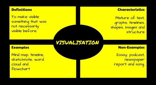
Dictionary.com defines visualisation as:
To form a mental image of.
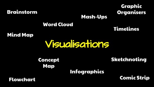
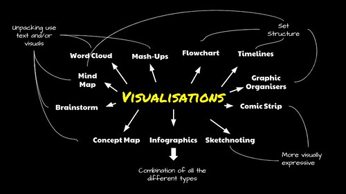
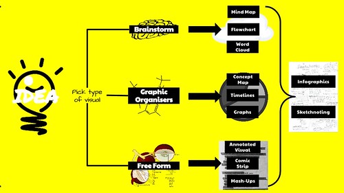
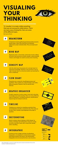
Brainstorm
flickr photo shared by mrkrndvs under a Creative Commons ( BY-SA ) license
A brainstorm is about gathering spontaneous ideas around a specific topic or idea. Although there are many variations, one of the keys is to hold back judgement in order to find the limits. An example of one such variation is NoTosh’s 100 ideas in ten minutes. Some programs to support brainstorming include Answergarden, Padlet, Dotstorming, Socrative, Poll Everywhere and Google Apps. while Richard Byrne has compared a number of options. What is important is the ability to collaborate.
Word Cloud
flickr photo shared by mrkrndvs under a Creative Commons ( BY-SA ) license
An extension of the brainstorm, the word or tag cloud involves visualising text as a cloud. Usually one word at the time, the size of the text is dictated by the amount of times it is represented. Word clouds can also be used to measure the frequency of words in a text. Some programs used to create word clouds include Wordle, Word It Out, Tagxedo, ABCya, Wordclouds.com and Tag Cloud Generator for Google Apps.
Mind Map

flickr photo shared by mrkrndvs under a Creative Commons ( BY-SA ) license
Beginning with a central idea, mind maps involve adding branches and keywords to build a deeper understanding. Colours and images are used to convey more meaning. Although they can be drawn, there are also a range of programs you can use to create mind maps, including bubbl.us, Freemind, Connected Mind, Google Drawings and Mindmeister
Concept Map
flickr photo shared by mrkrndvs under a Creative Commons ( BY-SA ) license
Like the mind map, the purpose of a concept map is to present knowledge. However, the structure is not so rigid. Instead, there is a free form which can lend itself to more complexity. Although the same applications used to create a mind map can be used to make a concept map, some additions include XMind and CMap. See the Software for Mindmapping and Information Organization for more ideas.
Flowcharts
flickr photo shared by mrkrndvs under a Creative Commons ( BY-SA ) license
Flowcharts are a means for visualising processes and workflows. They use a range of shapes, each with a different purpose. A prime example is the representation of algorithms, an essential element of the new Digital Technologies curriculum. Some programs to support brainstorming include Lucidchart, Google Drawings, Gliffy and Draw.io.
Graphic Organisers
flickr photo shared by mrkrndvs under a Creative Commons ( BY-SA ) license
Graphic organisers involve using a visual aid to develop knowledge and understanding. There are many different types of organisers, including relational (fishbone), classifications (KWL), sequencing (ladder), compare/contrast (Venn diagram) and concept development (story web). An easy way to create graphic organiser is with these Google Drawings templates from Matt Miller.
Sketchnoting

flickr photo shared by mrkrndvs under a Creative Commons ( BY-SA ) license
Sketchnoting is about helping us think deeper by mixing, matching and making links using text, image, structure and flow. Some call it visual note-taking, others doodling. For some it is a useful way of summarising different content, while for others it is a creative way to brainstorm new ideas. There are a range of resources and presentations to help with sketchnoting including Sketchnoting FOR Beginners (Silvia Rosenthal Tolisano), Brain Doodles, Sketchnoting for Beginners (Sylvia Duckworth) and How I Teach Sketchnoting (Royan Lee). I have also created a Youtube playlist of useful videos.
Infographics
flickr photo shared by mrkrndvs under a Creative Commons ( BY-SA ) license
A mixture of text, images and data visualisations, infographics are designed to communicate information quickly and clearly. Like sketchnotes, infographics do not necessarily have a set structure. It is however common for them to be long and skinny. This is to fit them within width of a blog. Some programs that help with making infographics include infog.ram, Canva, Piktochart and Google Drawings.
Timelines
Timelines are a means for visualising a period of time chronologically and with a consistent scale. This scale can be days, years, months, it just depends on the topic in question. There are a few applications that allow you to create digital timelines, including Dipity, Time Rime, Read Write Think, Timetoast, TimeLineCurator, MyHistro and TimelineJS. Just note, TimelineJS requires Google Apps.
Comic Strips
flickr photo shared by mrkrndvs under a Creative Commons ( BY-SA ) license
An interpretative visual means of presenting ideas, comic strips often lend themselves to storytelling. Some applications that support the creation of comics include Create Your Own Marvel Comic, MakeBeliefsComix, Chogger, Canva and Witty.
Mash-ups

flickr photo shared by mrkrndvs under a Creative Commons ( BY-SA ) license
Doug Belshaw suggests that, “remixing, re-appropriation and riffing off other people’s work just seems to be part of what we do as human beings.” There are many ways of mashing-up visuals. Often this involves taking something that is used in one context and re-appropriating it for another. This can include making creative maps or adding commentary to an image in the creation of a meme. There are no specific programs used to create mash-ups as there are no specific mash-ups.
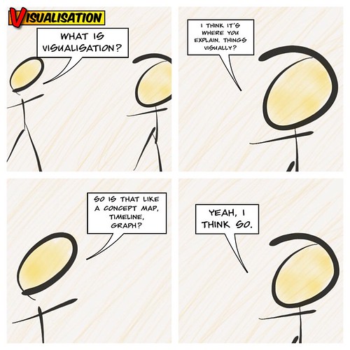
So what about you? How do you visualise? What applications have you used? As always, comments welcome.
A Guide to Visualisations by Aaron Davis is licensed under a Creative Commons Attribution-ShareAlike 4.0 International License.
[…] @mrkrndvs: Guide to all things visualisation readwriterespond.com/?p=1203 HT @royanlee @NoTosh @langwitches @sylviaduckworth @dajbelshaw #digilit […]
Thanks for this. How did you know? I’ve wondering about the best way to create a timeline and here’s a whole list of resources and other avenues to pursue other topics. Awesome!
Also, your blog title is one that sums up so nicely my own approach to the world of words. (A bit of title envy, I confess.)
Mind mentioning the tools you have used for these graphics? Is it Creately ?
I am going to presume that you mean the infographic? That was created with Canva (https://www.canva.com/design/DABgApFF90U/6DJTt5TUTLiPq5LaRCQJlA/view?utm_content=DABgApFF90U&utm_campaign=designshare&utm_medium=link&utm_source=sharebutton) Beyond that, the majority of the images are simply created with Google Drawings.
Awesome! Cheers Aaron
Austin Kleon provides a demonstration of how he creates mind maps.
John B. Sparks’ histomap is another great example of a visualisation:
Celebrating the birth of Florence Nightingale, Cara Giaimo discusses her impact in regards to the spread of ideas, not just as the ‘Lady with the Lamp’. After returning from Crimea, Nightingale spent two years putting together her notes and data. Fearing that the conclusions might be lost in the length of the report, she developed a series of infographics, some of which she even leaked to the press.
It is interesting considering this in light of the modern world where all information is presented to the press using such visuals and then the scientific community. I wonder if it would have still been lost in the noise?
Source: 1 dataset. 100 visualizations. by @ferdiocom
A collection of visualisations with an explanation for each.
ᔥ “Jeremy Keith” in Adactio: Links—1 dataset. 100 visualizations. ()